website under development!
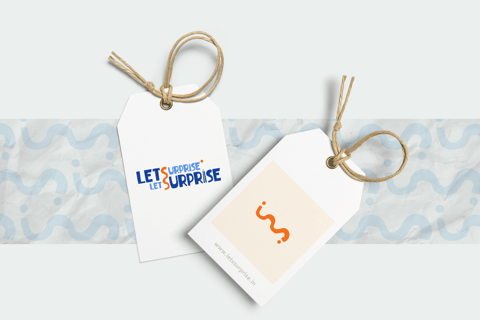
LetsSurprise was rebranded form this to...


This!!!
Introduction
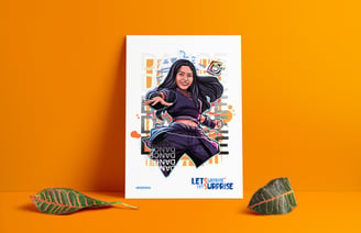
LETSSURPRISE, a brand that evolved from a customized gifting business to a digital art and merchandising agency, required a fresh and dynamic brand identity. The challenge was to balance playfulness with professionalism while retaining essential elements from the old brand.
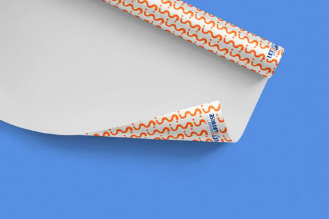
The previous brand identity felt generic and outdated. It featured a lowercase script font, wavy lines, and warm gradient colors. The key pencil element symbolized customization but needed a modern twist.
The rebranding positioned LETSSURPRISE uniquely, reflecting its creative essence. Also retaining the pencil motif honored the brand’s history while embracing change.
Typography: Uppercase gothic font for clarity and impact. The pencil motif subtly integrated into the typography design.
Color Palette: Blue (for digital art sophistication). Orange (for vibrant merchandise).


